Welcome!
This portfolio explores select projects from enterprise-level software companies that I’ve designed for. Please note, the scope of information that I can share about each project is limited to protect trade secrets.
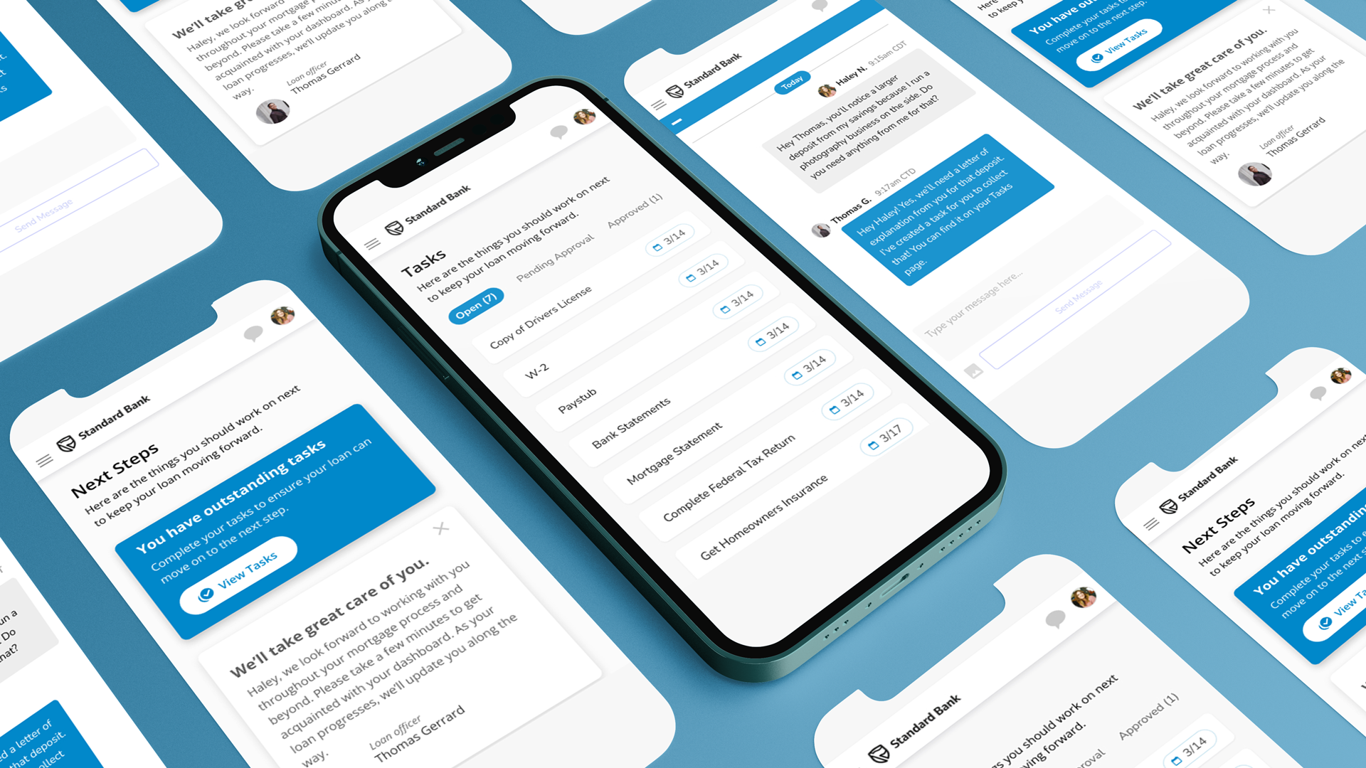
Maxwell Borrower Dashboard
Released to General Audiences October 2023
Maxwell is a software and mortgage company that supplies banks and credit unions with enterprise-level software and third-party in-person business solutions.
During my time at Maxwell, the mortgage industry experienced one of the most difficult markets since 2008 and I was responsible for identifying key design objectives that would help lenders retain leads during this strenuous time.
Improving this experience was a major milestone in my career and it was one of the most successfully shipped features in Maxwell’s history.
Keep reading to learn more about this project.
Background on this project
Maxwell’s most prominent business pillar is their Point of Sale platform which, among many things, manages the relationship between a borrower hoping to buy a home and a Loan Officer whose team facilitates the loan transaction. The process of applying for a mortgage is already complex and stressful for most borrowers — this is especially true during downturn markets like we’re in now.
With borrower’s current hesitancy to purchase, customers look to Maxwell to ensure everything is being done to facilitate a delightful experience for borrowers. After a thorough investigation, I identified that the borrower post-application experience was an opportunity to influence company objectives and increase lead retention. As of today, Maxwell’s borrower dashboard touches an average of 16k customers per month.
Initial Investigation
The first step in identifying design opportunities for the business was to observe borrowers and extrapolate important data points to understand user behavior at a holistic level.
By leveraging qualitative and quantitative information, I was able to identify a clear path for improvement on the platform. Here are four main takeaways from that research:
Borrowers had no sense of progress or direction.
Borrower’s struggled to understand tasks and often uploaded the wrong documents (which causes unnecessary delays).
Borrowers often missed important time-sensitive tasks like signing documents prior to closing.
The borrower dashboard was not optimized for devices and the misuse of space created chaos for borrowers.
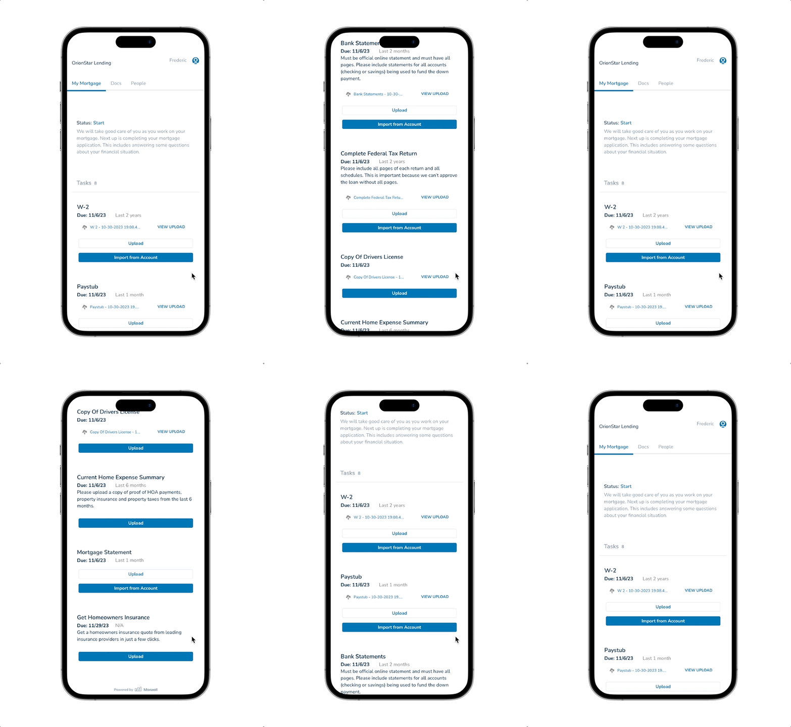
Example of a Frustrating Mobile Experience (Legacy)
Over half of borrowers engage with the Maxwell platform on a mobile device, yet the borrower’s post-application experience was not optimized for it.
A flaw of the original design was that all task information was visualized at the same level and when the borrower would upload documents, the page only grew longer. The average borrower uploads 8 documents per task, which means this page would get exceptionally long.
What’s worse, documents that were rejected by the lender were not visualized on the mobile experience which caused immense confusion for borrowers and lenders.

Legacy Mobile Usage Data
Most borrowers did not complete a task on mobile during their first run.
Avg Events per Session: 27
Avg Session Length: 1:55
Desktop Usage Data
Borrowers often uploaded orphaned documents instead of uploading them to the task.
Avg Events per Session: 33
Avg Session Length: 3:02
Flipping the script
With the information that was uncovered during UX research, I was able to set a flag in the sand and establish usability metrics for existing behavior so that we could have something to measure against. Borrowers want to complete their tasks because they want to buy a home — the next steps just weren’t clear for them. Taking a two-step approach to tasks ensured borrowers stayed focused on one thing at a time, as opposed to seeing everything all at once.
This update has been especially helpful for handling rejected documents (which was previously not visualized on the mobile experience).
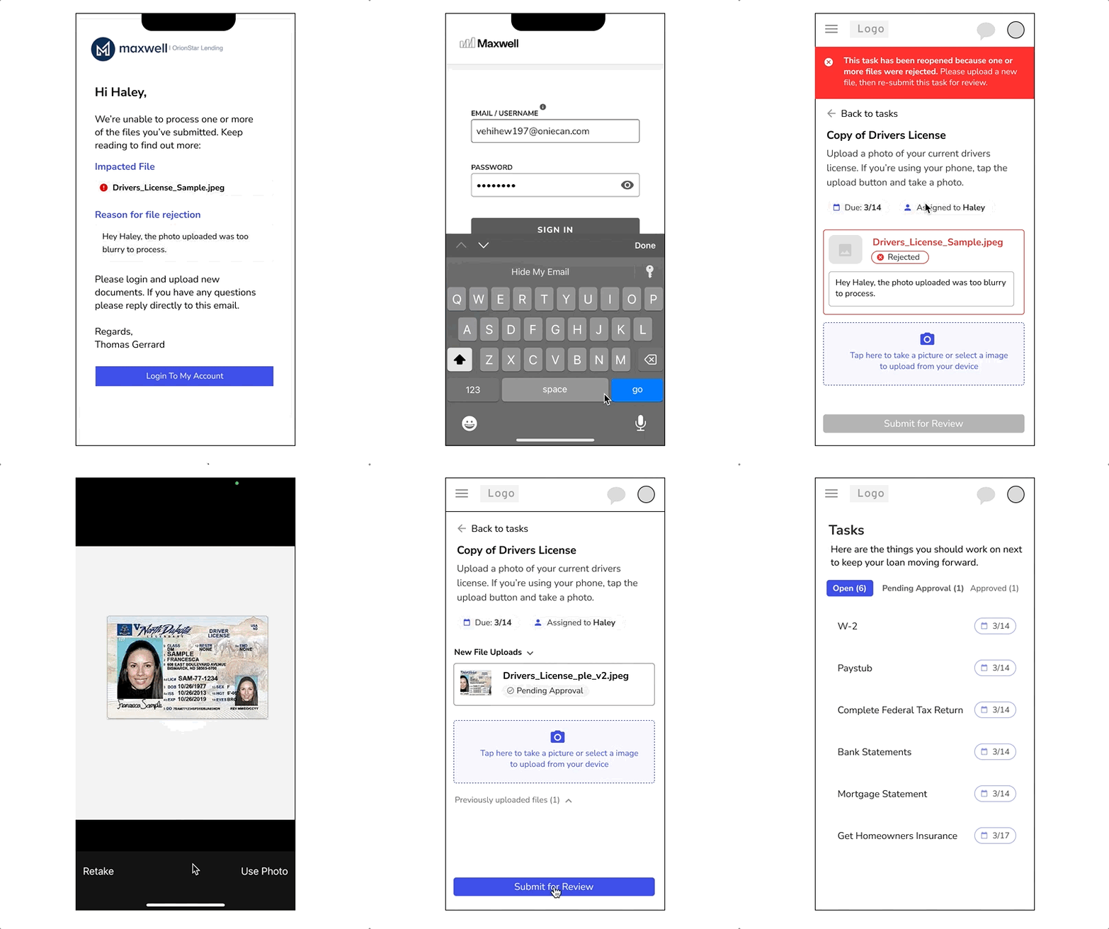
Example of Contextual Improvements
There are a number of reasons why a document may be rejected by a Loan Officer but, if not addressed quickly, they can slow down loan processing. This is why borrowers must act quickly to upload new documentation for the Loan Officer’s team to review.
The two-step task approach (task list & task details page) allowed us to provide the necessary context for a borrower to know what happened and what to do next. Further, by leveraging task sorting, rejected tasks are always first in the list.
This prototype was very successful and testers pointed out how easy it was to understand why a document was rejected and what action was needed.
Feedback & User Testing
I continued to test prototypes with users to understand what was working and what wasn’t. During this stage, I shopped prototypes and designs around with internal and external stakeholders to get their buy in. Overall, concepts were very well received, especially the task list organization updates. They felt this sense of progress was exactly what borrower’s needed.
Below, you’ll see a micro-prototype of behavior that puts tasks into categories like “Open”, “Pending Review”, and “Completed”. This introduction of task organization helps borrowers understand what work remains to be done and what tasks they’re waiting for approval on. This sense of clarity was a talking point with nearly every tester who walked through the various prototypes.

Opportunity for Improvement
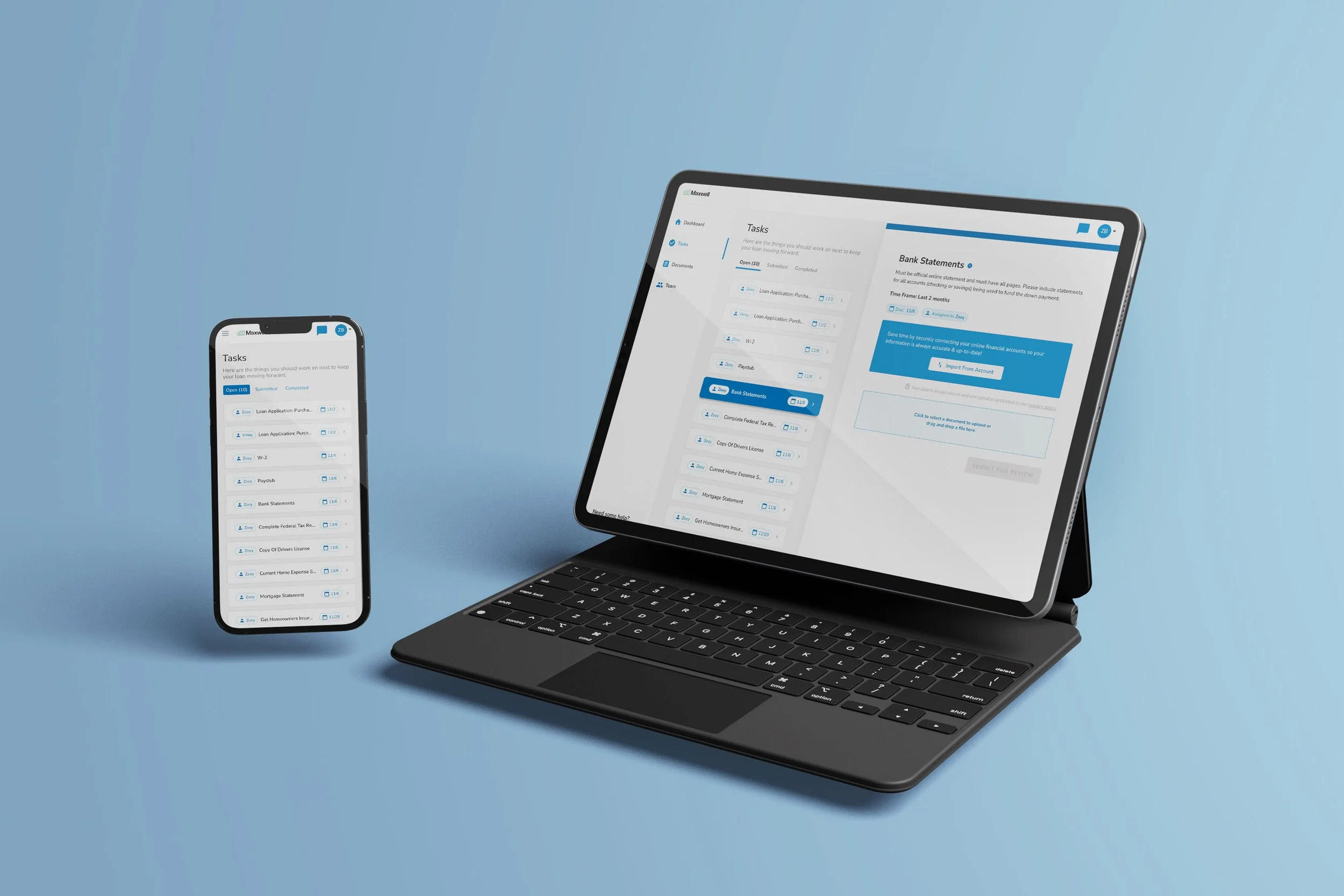
It was clear with the legacy design that borrowers were missing important context about the tasks they were assigned. To combat this, I focused on leveraging an information hierarchy that was tailored to each device, providing the necessary details about a task when most appropriate.
For example: Borrowers on mobile were overwhelmed by seeing all task information at once when they really just wanted to see what work was left for them to do.
On larger displays, we have the ability to show the task list and active task at the same time— providing deeper context when the screen real estate was available.
FAQs
This is a frequently asked question?
It all begins with an idea. Maybe you want to launch a business. Maybe you want to turn a hobby into something more. Or maybe you have a creative project to share with the world. Whatever it is, the way you tell your story online can make all the difference.
This is a frequently asked question?
It all begins with an idea. Maybe you want to launch a business. Maybe you want to turn a hobby into something more. Or maybe you have a creative project to share with the world. Whatever it is, the way you tell your story online can make all the difference.
This is a frequently asked question?
It all begins with an idea. Maybe you want to launch a business. Maybe you want to turn a hobby into something more. Or maybe you have a creative project to share with the world. Whatever it is, the way you tell your story online can make all the difference.
This is a frequently asked question?
It all begins with an idea. Maybe you want to launch a business. Maybe you want to turn a hobby into something more. Or maybe you have a creative project to share with the world. Whatever it is, the way you tell your story online can make all the difference.
This is a frequently asked question?
It all begins with an idea. Maybe you want to launch a business. Maybe you want to turn a hobby into something more. Or maybe you have a creative project to share with the world. Whatever it is, the way you tell your story online can make all the difference.
This is a frequently asked question?
It all begins with an idea. Maybe you want to launch a business. Maybe you want to turn a hobby into something more. Or maybe you have a creative project to share with the world. Whatever it is, the way you tell your story online can make all the difference.
Context is King 👑
I solved two key problems with this newly designed experience to provide high level sense of progress for the borrower, along with a more detailed task interface to improve borrower focus and reduce document rejections.