Focus — Swipely Reimagined
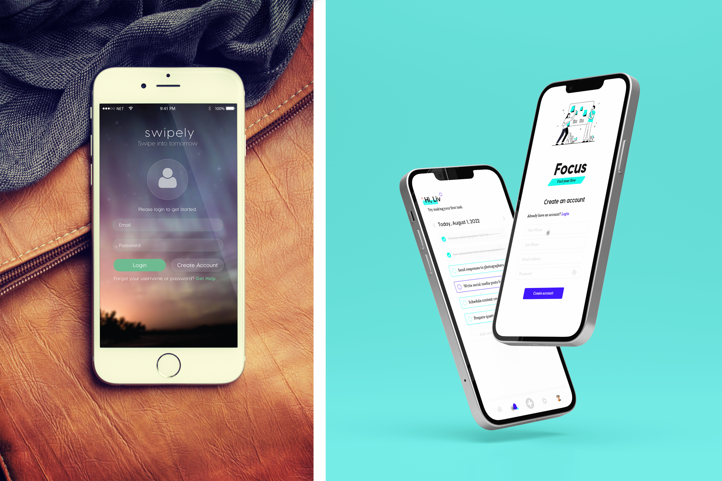
Designers should always look back at past designs and think critically about what was successful and what could be improved upon. The goal is to always create kick-ass software, but sometimes we get in the way by trying to solve problems that aren’t even a thing yet— that’s why it’s so vital to fully understand what the minimum viable product (or MVP) is for any given feature or app.
I initially designed Swipely as an audition piece and case study when I was looking to get hired as a product designer (8+ years ago) at a new company. At that point, I had already been a product designer for a few years — but I felt I had reached the limit of what I could learn where I was at so it was time for a change.
What is Swipely?
At the core, Swipely is a task management tool focused on helping users track and manage their daily tasks and goals. In order for Swipely to be successful, users had to quickly create tasks on the fly, upload files to tasks, and add comments in addition to being able to create, edit, and delete a task.
The challenge was to not only create a brand identity for Swipely but to execute ideation, wireframing, and design for functionality around the product’s basic needs, which were:
View a list of their daily tasks and option to categorize them
Add notes and comments to existing tasks
Upload documents and images to tasks
Check tasks off a list
Edit and delete tasks
Understanding the MVP
In my first go-around with this project, I was too focused on wowing (ew, I know) my audience. I wanted to show them that I could not only ideate the solutions they asked for but I could think ahead to functionality that the user might find helpful, too.
While, at the time, this strategy paid off— I quickly learned this wasn’t the best approach to designing and building software because of the dreaded term SCOPE CREEP. If you haven’t heard of scope creep, it’s essentially any functionality that falls outside of the MVP product. That isn’t to say that the functionality outside of an MVP solution isn’t helpful, it’s just not needed right now. Remember that, it’ll be important later.
Over time, my experience has taught me to focus on MVP first and to challenge myself to think critically about how the design could be made flexible to accommodate for future enhancements.
Introducing Focus
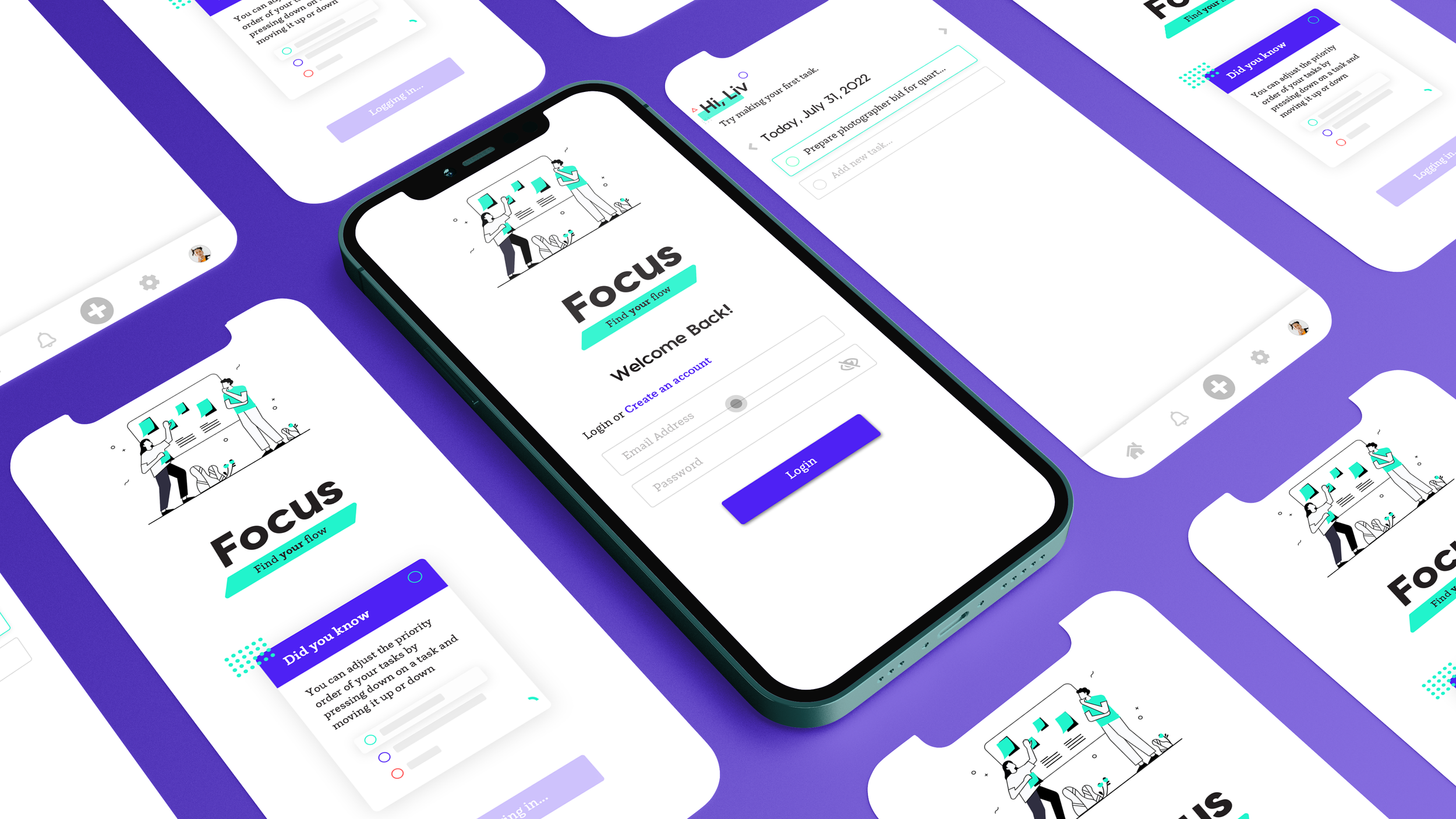
Focus was built with the exact same set of standards and criteria as Swipely, however with a much more focused approach and execution. In this blog post, I’ll talk through key functionality for Focus, solving design challenges with new and innovative solutions, and key design components used to execute the new baseline functionality. Ready? Let’s get weird.
A little background on Swipely’s name
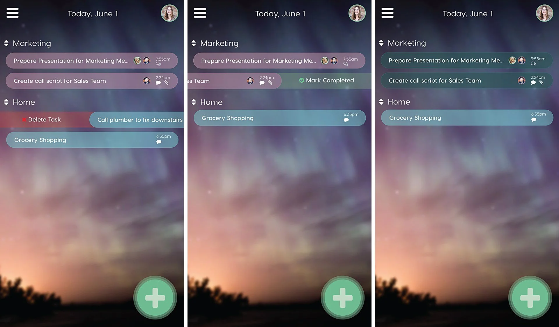
Before we dive into a behavioral analysis of Swipely’s key components, it makes sense to talk about how Swipely got its name. One of the key behaviors of Swipely is the interactive, swipeable (is that even a word?) tasks on the home dashboard. While it could be satisfying to use in some way, this behavior isn’t the best execution of design because it’s too simple for a user to accidentally delete a task.
Another flaw of the design is the overall typography and use of space. Tasks are way too small for me to read (or maybe I’m just getting older? EEK!) and the tasks are located really high up in the UI. Most people would struggle to reach the tasks at the top and there’s no clear way to switch between calendar days. We’re going to choose to overlook the obvious design flaws of a busy background and excessively large animated button. Overall, it was a good first attempt, but it leaves a lot to be desired.
I used my north star as my guide while designing the Focus the home screen and task behavior. This time, I didn’t let myself get bogged down with fuzzy functionality (or things that fall outside of the original scope) and I believe that led to a much more usable and enjoyable experience.
How focus does it better
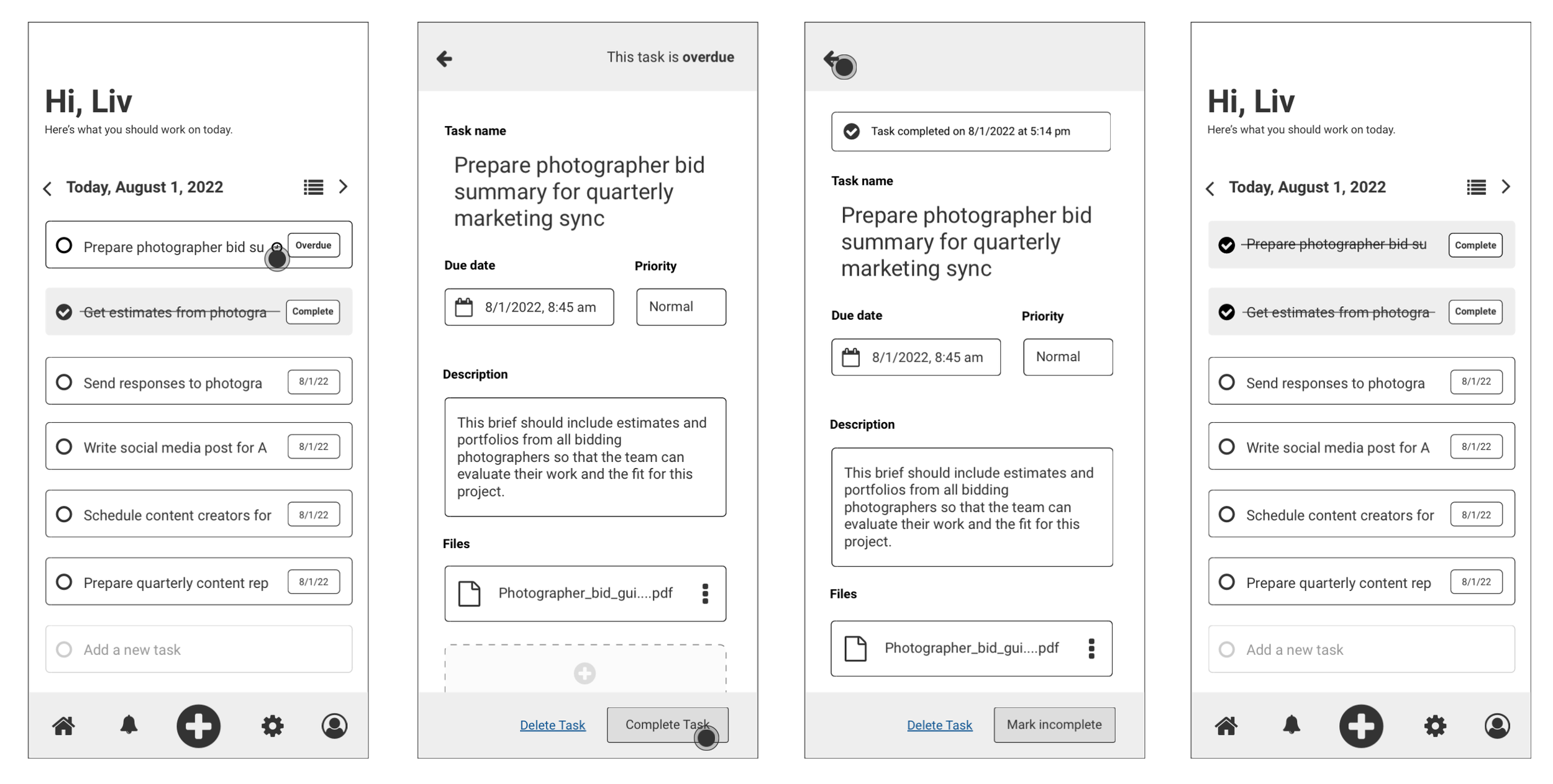
There are two ways a user can complete a task in Focus. They can click on the circle to add a checkmark right from the Home screen, or they can click on the task to get more context and mark it as complete from the footer menu as shown below.
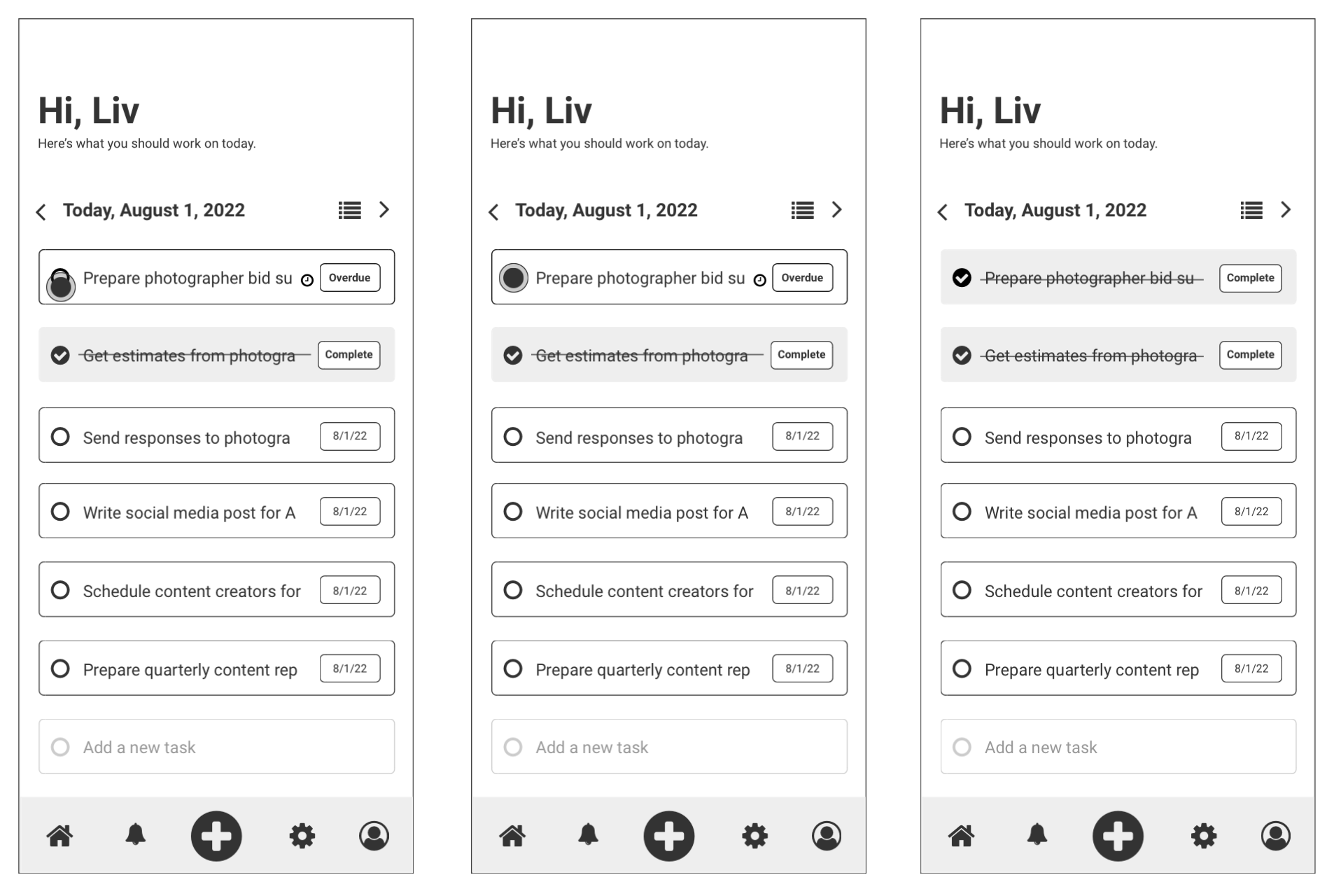
This behavior is extremely valuable for quick tasks, especially those that fall outside of a user’s work-life. For example— “Call to refill the dog’s meds”. It’s a simple task that I often write down on my todo list— but not a task that requires many details. A simple reminder will suffice— and this behavior makes it easy to check those tasks off right from the home screen.
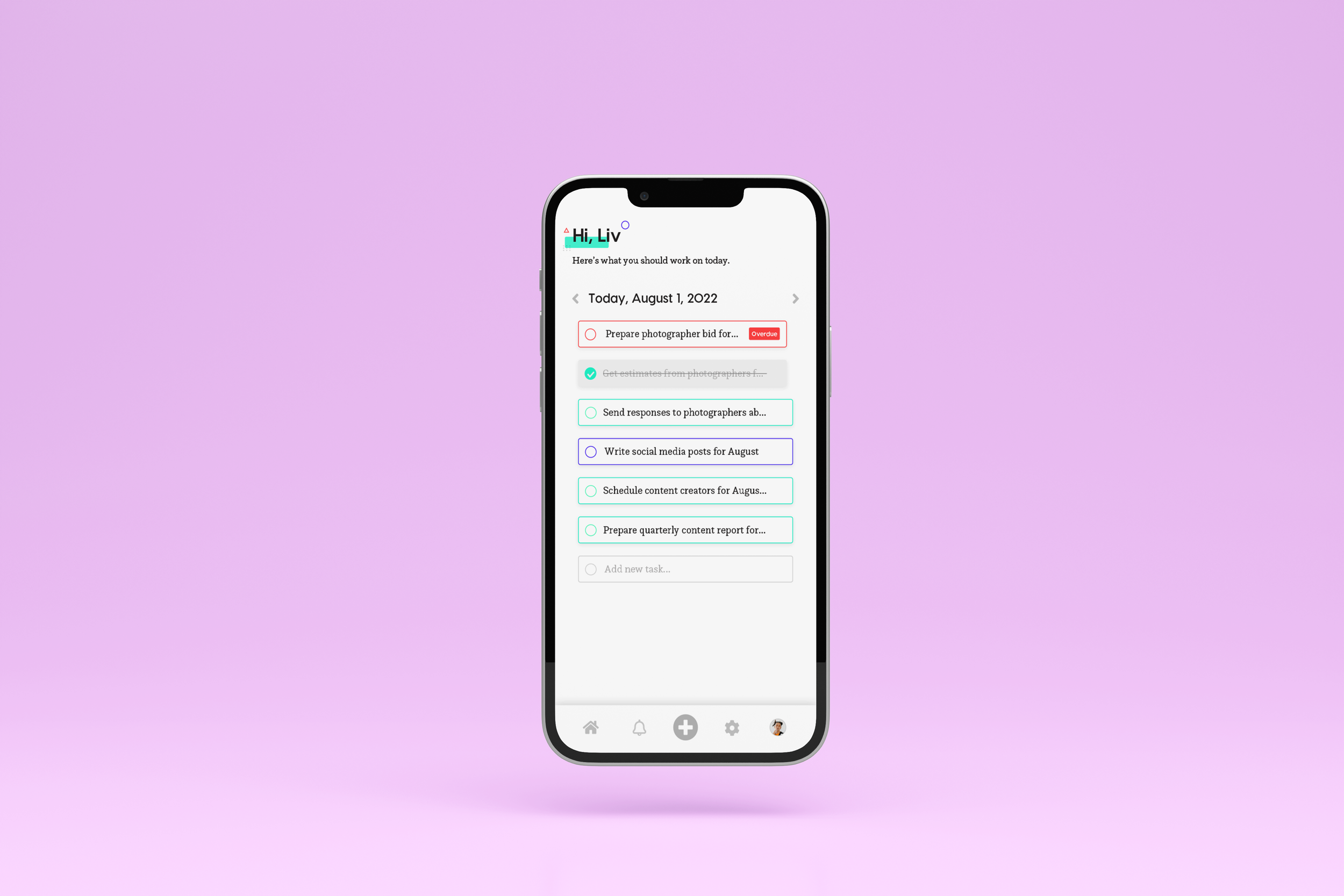
Focus’ home screen was fully redesigned to emphasize tasks and visually reinforce the user’s progress for any given day.
Now that we’ve seen some wireframes showcasing behavior, lets look at how the design reinforces the information available and the actions taken by the user.
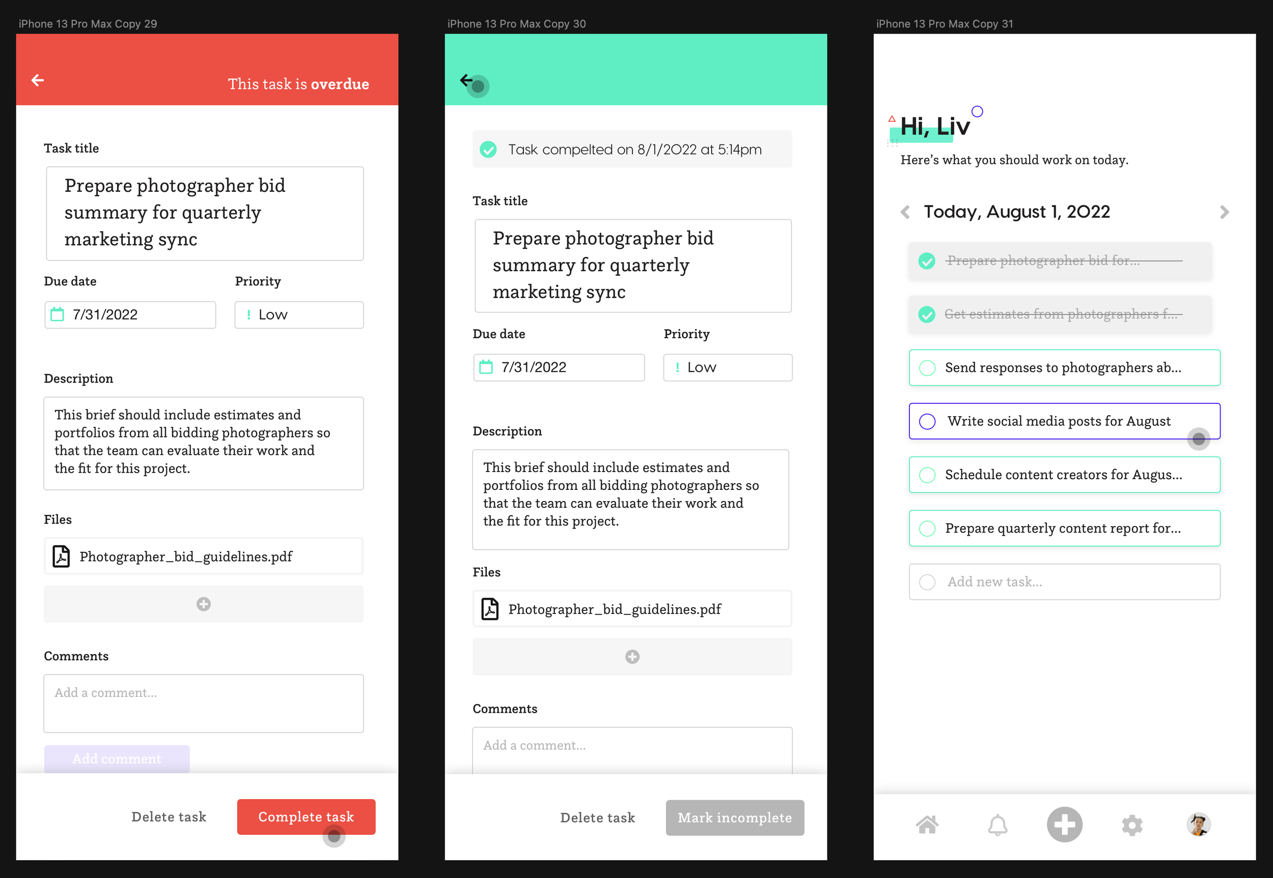
Now, users can get the context they need, when they need it, in order to determine whether a task should be completed (or perhaps marked incomplete). In the above scenario, a user wants to know more about the overdue task before marking it done. Initially, upon opening the task, the UI is changed to red to reinforce that the task is overdue— this level of visual communication provides users with quick knowledge without having to read into anything further to understand what it means.
When the task is completed, the UI changes back to the standard coloring and as the user navigates (via the back button at the top) back to the home screen— they see visual confirmation that their task is now complete.
Speaking of tasks…
Let’s look at the process of viewing/creating a task. One of the flaws with Swipely was that I was trying to show too much and to do too many things at once for a mobile app. During my time working in the industry, I’ve learned that every single action that’s possible on a screen can derail a user from reaching their ultimate goal. What that means, then, is that each interaction MUST drive the user towards their end goal— if it doesn’t, then it’s a distraction.
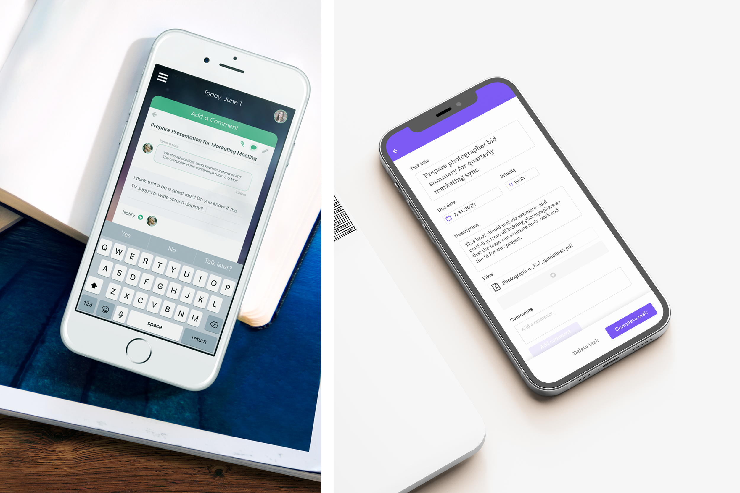
Here’s an area where Swipely expanded past the scope of MVP— it had color labels, chats, a time picker, team functionality— way too much for what an MVP product needed. Why is that important to note? Because this is where growth and experience come into play. Originally, I made a lot of assumptions about how users would interact with my designs based on my own personal usage of tasks. This wasn’t the right approach and it expanded the scope of this project tremendously. See for yourself…
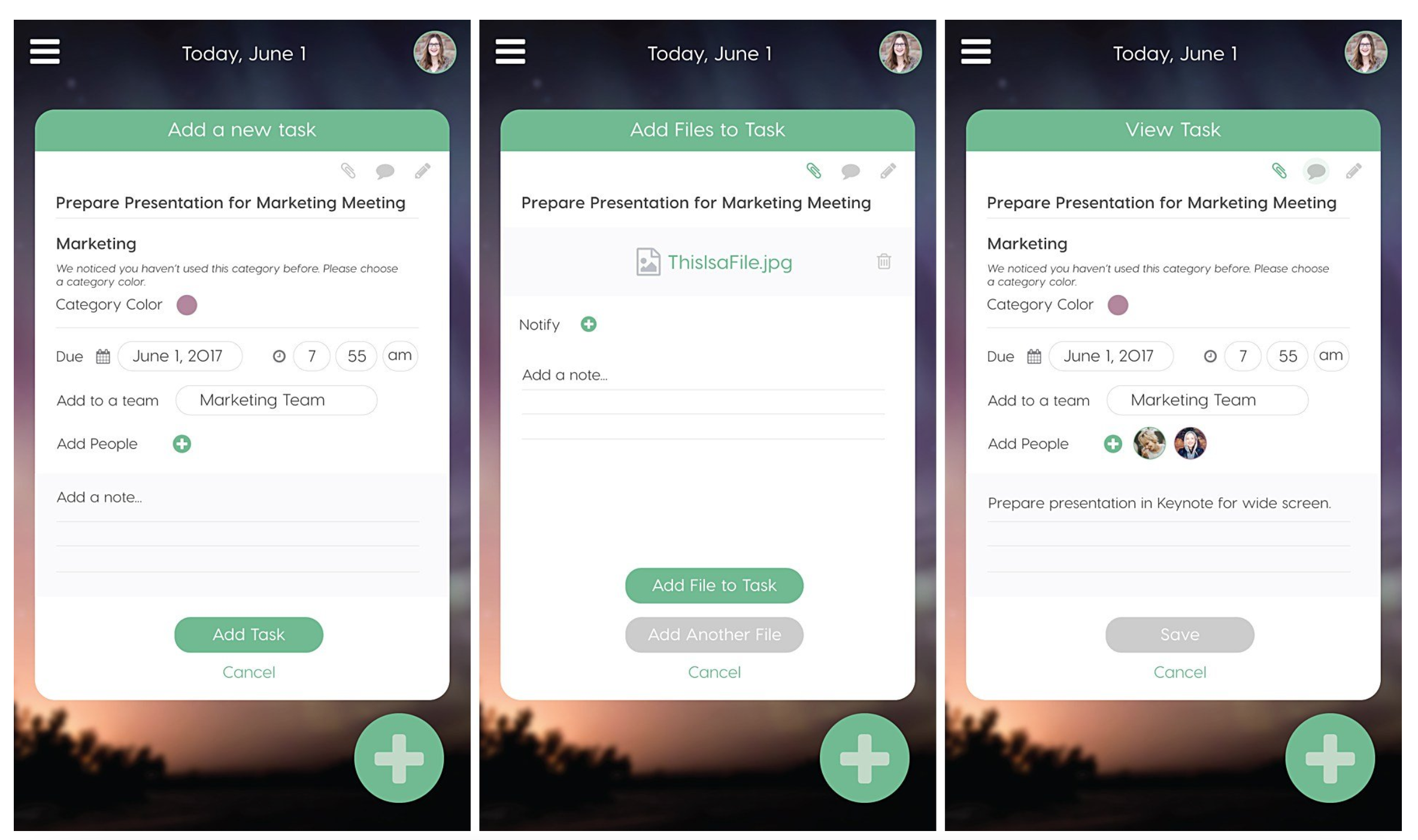
When doing this re-design, I let the MVP criteria be my north star and created a design system that can be expanded to add functionality as it is needed — and based on user feedback. I didn’t create a fully-linear process so that users could find their own strategy with how best to use this tool— after all, it’s for them and not me.
How focus does it better
Focus addresses some key functionality I missed during my first iteration of creating this project— the ability to create tasks on the fly. This was crucial behavior that I missed because I wasn’t focused on the MVP (we’re all human, amirite?). This time around, I stayed true to what was needed to create a great foundation for an easy-to-use product.
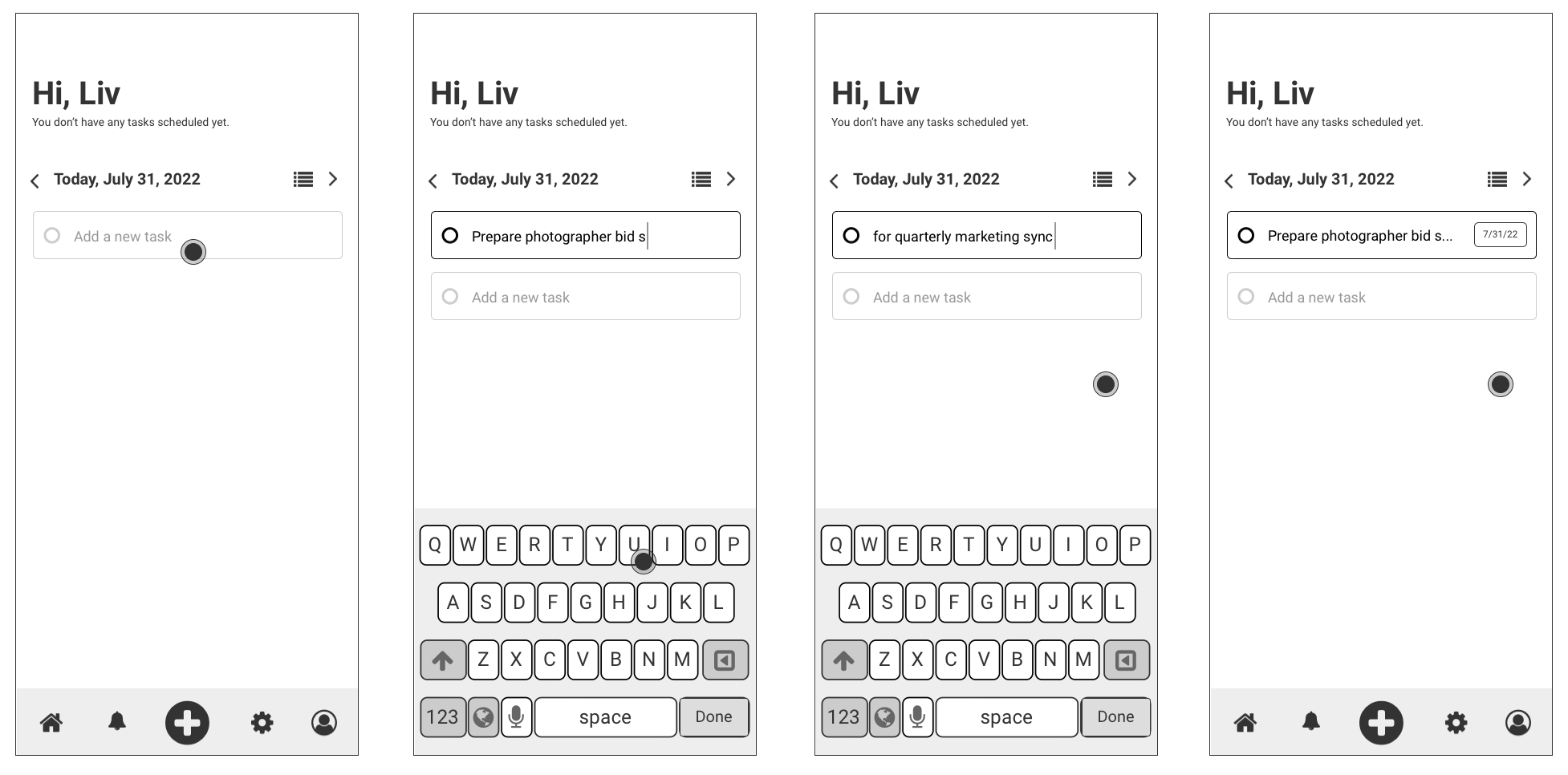
Users can easily create tasks on the fly, removing previous frictions for getting tasks in the app. When adding tasks on the fly, all that’s required is a name for the task, the rest of the details can be filled out later.
How Focus can provide better value
If a user knows the additional information at the time of creating a task, they can use the “+” create button at the bottom of the footer. This placement was key so that users can reach this UI without having to extend their thumbs to the top of the screen, which some apps have you do.
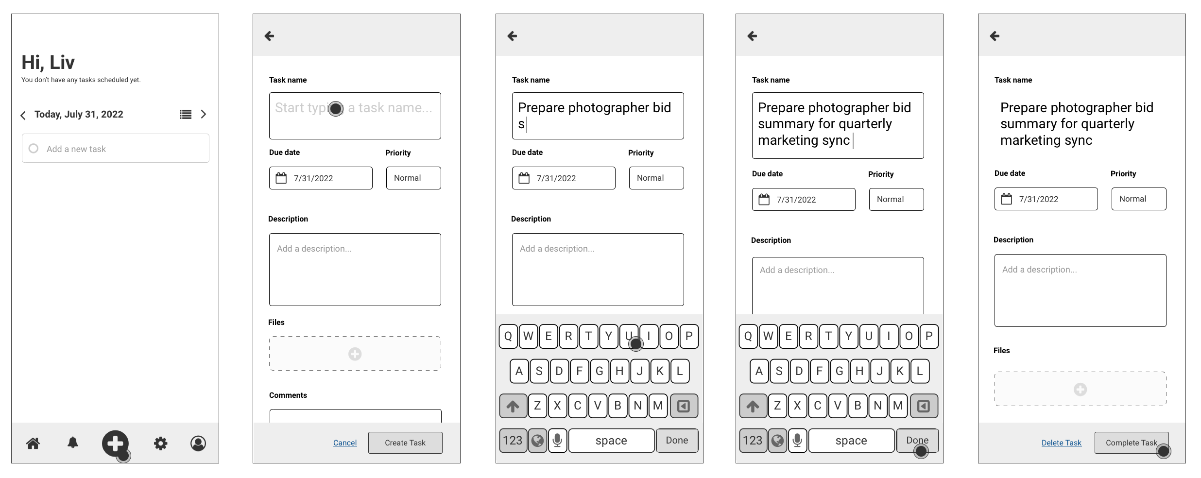
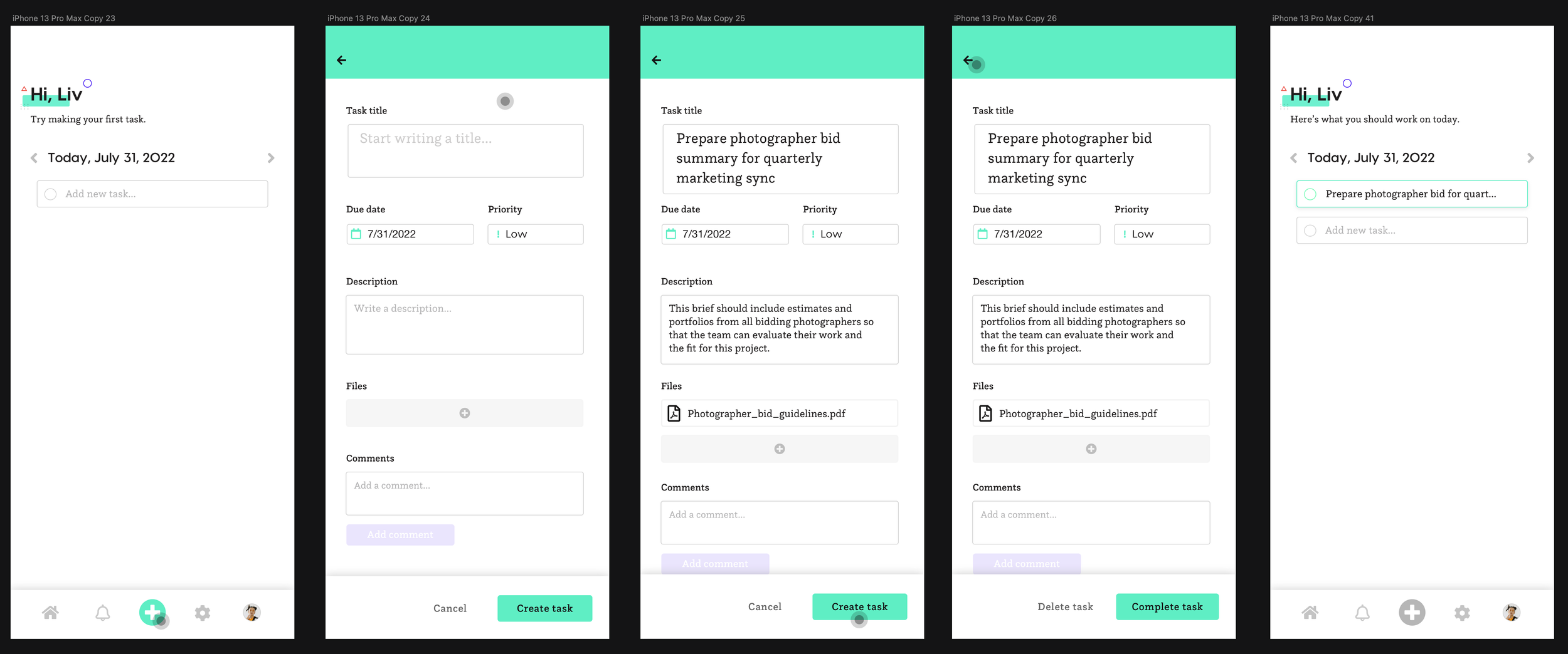
The process of creating a task with supporting context is ultra clean and simple as outlined by the design below. You’ll notice that the footer CTA changes from “Create task” to “Complete task” once the task has been created. The user can then use the back button to navigate back to the home screen where they’ll see their new task.
Conclusion
Staying true to a north star is the easiest way to make kick-ass software that can be expanded upon later. During my time reimagining Swipely, I realized that the core of what the app did wouldn’t serve users in the way they needed— so I reworked everything from the ground up to provide solutions that work, look beautiful, and are easy-to-use.